
Tuesday, April 26, 2016
Monday, April 25, 2016
M6 Website - JWS.com

For the website project, I found
myself spinning between ideas, but concerned about advertising or promoting
anything already copyrighted, that I was interested in. Ultimately, I chose the
safest though not necessarily the easiest path, I decided to advertise myself.
This
website mock-up is or JWS.com (using my initials), a website that would be
dedicated to explaining my artistic goals, exposing my artwork, providing a
method for contact, and a section to order consigned original artwork. The
majority of the images used are my original artwork, with the remainder (the
web specific ones) taken from Pixabay.com.
Besides
the obvious links provided, the bottom of the site would act like a scrolling
bar allowing users to choose the background picture for the site, while
scrolling through select pictures from the portfolio section. The main logo for
the site is my personal signature for originals I create. I drew up a large
copy of my artistic signature, scanned it, cropped and erased around it, then
when I applied it, I painted it darker on the webpage.
I
think this site would be effective as it has very little to distract the user
from the focus of the site – my artwork. There would be easy access to viewing
the work (using the image scroll bar on the bottom) thus a potential viewer
could quickly decide if they were interested and whether they wanted to delve into
my portfolio and/or request a consignment piece from me.
M6 Images Used
All images are either original artwork or obtained through Pixabay.com (a free image use site)


Friday, April 1, 2016
M5 Avatar - John the Impaler
Initially I was
going to follow the directions for making an ‘avatar’ character from the Hollywood
movie. However, as I was working on the silly pic I chose, practicing the new
techniques, I changed horses in midrace. While I was working with the
dodge/burn tool, I decided I might want to try making a classic vampire-like
character instead. I planned to make a comedic version since I was using such a
silly picture. As I was working my way through the construction I altered the
picture further to turn my silly original expression into a more classic-aged
vampire facial appearance.
Once
I was certain I was creating a vampire avatar, I started with my background,
looking for a castle or medieval scenery. My chosen background picture I flipped
horizontally and then darkened until I was happy with the depth of shadow in
the buildings (the sky was still too bright but I fixed that later).
For
the image of myself, I cropped it from the larger picture, then erased all the
exterior details to interpose overtop of the medieval church scene. From here,
I had a rather long experimentation with the dodge/burn tool, to extract the
correct paleness in the skin and darkening of my blonde hair. In contrast to
the rest of my flesh tones, I darkened the skin around the eyes, to give them a
sunken look.
Finally
happy with my darker hair and pale skin I began to work on the eyes. I slightly
enlarged both eyes, and then each Iris, so the eyes would ‘pop’ a bit – become a
focus while looking at the picture. The only detail I was missing at this point
was some nice vampire teeth, which I cropped out of a picture of a tiger, and
after rotating slightly and resizing, was able to fit into my mouth area.
Feeling
I was down to my final steps, I wanted to round out the look and feel of the picture,
so began recoloring and painting. I ended up using three separate layers for
painting, as each had different opacity and fill levels. I changed my eyes to
red, lowering the opacity to allow my natural glint to shine through the new
color. For my teeth, I added some blood, as well as some blue-tone to shadow
the white. On the same layer as the teeth, I painted a dark-blue hue throughout
what remained of the lighter areas in my hair, going for a Raven-black look. On
the 3rd layer, I applied a darker blue over the sky, to give a
feeling of dusk or early evening, which I still had to darken, slightly, after
adjusting the opacity and fill, before I was happy with it.
I feel the image is effective, for what it is,
having grown up on old B&W and early color Dracula movies. The overall image
captures the ‘feel’ of that movie genre. By the time the project was finished,
I had altered everything in the picture in some way, except the shirt. Given
that I started with a silly looking self-image and converted it into an angry
undead, that in no way resembles the original picture, I am happy with the
results.
Note: The tiger
image (teeth) and the medieval church picture (background) were both obtained
through Pixabay.com, a free to use image database.


M5 Sketches

A previously made sketch of myself (above) that I used as a base pic for my Avatar sketches below.


Thursday, March 17, 2016
M4 Book Cover

I began this project with a few set ideas
for book covers (my favorites being the Chipmunks & Jazz Singer ideas).
However, as I was working through using some new functions in Photoshop I found
myself staring at an image I wanted to use. After a little thought, I settled
on doing a tribute book to the history of the NYS Philharmonic Orchestra.
The
image of the birds flying into the sunset (obtained originally from
Pixabay.com), I arrived at by altering the pictures color saturation slightly
as well as a hue change. I then added a 3x3 selected overlay of the blue color
to create a background. From there I added a gradient overlay, choosing to use
a linear light, and arrived with my Books background picture. From this picture,
the project seemed to drive itself.
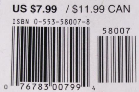
I
added my barcode and a Penguin Publishing logo, along with a New York logo, and
a silhouette of an orchestra. In adding the words to the cover, I used five separate
fonts in the lettering, at various locations, specific to phrasing or
institutions.
I
think my book cover has an appealing image to draw the eye, sophisticated
lettering and advertising-like wording to attract a varied audience. Persons
browsing for a new read, whether they are a fan of NYS, the Philharmonic, or
even history, may well be drawn to purchase a copy.
Barcode
New York State Symbol
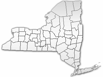
Penguin Publishing Group
Orchestra Silhouette
http://www.scuolaelmas.it/index_file/orchestra.gif
Subscribe to:
Posts (Atom)